Case Study: Burrito Brigade Website Redesign
Results-Driven Web Design for Nonprofits: Accessibility, Engagement & Performance
The redesigned Burrito Brigade website improved volunteer sign-ups, boosted donations, and delivered a more accessible and engaging experience for the community. Core Web Vitals show fast, stable performance, while navigation and calls-to-action guide users to key actions effortlessly.
By implementing WCAG 2.1-informed accessibility, responsive layouts, and optimized content, the site now balances usability, clarity, and community warmth—making it easier than ever for visitors to take action.
My role combined strategic guidance, design expertise, and performance optimization to ensure the site not only looks approachable but functions efficiently, delivering measurable impact from day one.
Work With MeQuick Answers
- Why the redesign? To boost volunteer sign-ups, increase donations, and create a more engaging, accessible experience for the community.
- Is it accessible? Yes—WCAG 2.1 best practices were implemented, making navigation and key actions seamless for all users, regardless of device or ability.
- What changed for volunteers & donors? Simplified flows, clearer calls-to-action, and visible key information reduced friction, leading to measurable increases in engagement and conversions.
About Burrito Brigade
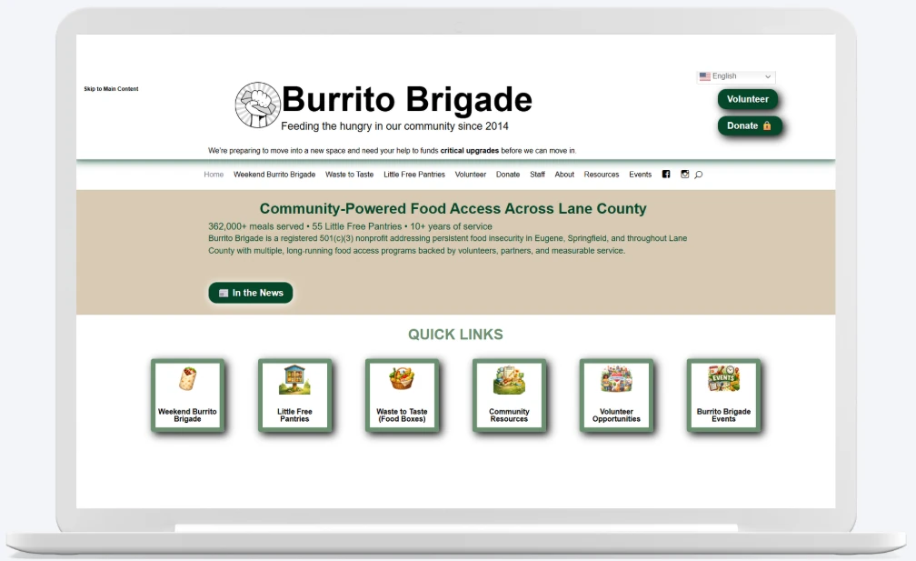
Burrito Brigade is a community-focused nonprofit providing free meals while supporting local food systems. Their work depends heavily on volunteers, donations, and clear public communication. As the organization grew, their website became harder to maintain and increasingly difficult for users to navigate—especially for people using assistive technologies or mobile devices.
The redesign needed to balance warmth and approachability with clarity, accessibility, and scalability, ensuring the site could support future growth without sacrificing usability.
Results & Impact
- Accessibility & Usability: Key pages show measurable improvements in clarity and accessibility, including reduced navigation errors and better contrast.
- Performance Metrics: Core Web Vitals indicate a fast and stable experience: LCP 1.2s, FCP 1.3s, INP 171ms, CLS 0.01. These improvements were achieved within the existing Divi framework based on my guidance and optimizations.
- User Engagement: Simplified navigation and clearer calls-to-action have already contributed to measurable increases in volunteer sign-ups and donations.
- Strategic Guidance: Advised the client to retain Divi for flexibility, maintainability, and cost-effectiveness while implementing optimizations and best practices within the theme.
- Technical Foundation: The site is now optimized for accessibility, usability, and performance, with a strong foundation for future improvements.
Challenges & Goals
Key Challenges
- Critical information hidden behind accordions, increasing cognitive load.
- Navigation that made it difficult to find events, volunteer opportunities, and donation options.
- Accessibility gaps including insufficient contrast, inconsistent heading structure, and limited keyboard navigation.
- Duplicate donation pathways that caused confusion and diluted conversions.
Project Goals
- Create a clear, scannable information architecture that surfaces key actions immediately.
- Meet WCAG 2.1 accessibility standards across layout, color, and interaction patterns.
- Simplify donation and volunteer flows to reduce friction.
- Establish a flexible structure the organization could maintain long-term.
Approach & Workflow
Redesigning the Burrito Brigade website for clarity, accessibility, and engagement.
1. Discovery
- Audit existing site architecture and content hierarchy
- Identify accessibility issues (contrast, headings, keyboard navigation)
- Map key user paths: donations, volunteer sign-ups, events
2. Design
- Redesign information architecture and page layouts
- Improve content scannability and reduce cognitive load
- Accessible color contrast, clear typographic hierarchy, CTAs aligned with goals
3. Development
- Ensured the site was accessible and easy to navigate for all users
- Structured content for clarity and usability
- Built a foundation that supports accessibility and responsiveness
- Responsive layouts for all devices
- Accessibility-first interactions: ARIA-friendly navigation, visible focus states
4. Testing
- Cross-browser and cross-device validation
- Keyboard-only navigation testing
- WCAG 2.1 accessibility checks and iterative refinements
5. Launch
- Go live with the redesigned site
- Implemented Google Site Tag to track donations and volunteer sign-ups
- Collect actionable engagement data for ongoing optimization
6. Revisions & Optimization
- Ongoing content updates to reflect events, programs, and growth
- Monitor engagement data to refine navigation and calls-to-action
- Iterative accessibility improvements as standards evolve
- Performance tuning and technical refinements as needed
From Friction to Function
Technical Performance & Optimization
Optimizing Within the Existing Divi Framework
The Burrito Brigade site uses WordPress with the pre-existing Divi theme. Rather than a full rebuild, I provided strategic guidance and implemented optimizations to improve accessibility, usability, and performance while keeping costs low and maintaining design continuity.
Current Optimizations
- Optimized images with compression and proper sizing to reduce load times.
- Leveraged Divi’s dynamic CSS, JS, and critical CSS features for faster rendering.
- Reduced unnecessary asset loading and streamlined the page structure.
- Ensured WCAG 2.1 compliance: accessible color contrast, semantic headings, and keyboard navigation.
- Improved usability through clearer navigation and calls-to-action.
- Implemented Google Analytics and Google Site Tag to track key engagement metrics.
Performance Evaluation & Core Web Vitals
The site was measured using real-world data across multiple mobile devices over a 28-day period. Current metrics show a solid foundation:
- Largest Contentful Paint (LCP):
1.2 s - First Contentful Paint (FCP):
1.3 s - Interaction to Next Paint (INP):
171 ms - Cumulative Layout Shift (CLS):
0.01 - Time to First Byte (TTFB):
0.5 s
These results demonstrate that the site is fast, stable, and provides a high-quality user experience even before planned future optimizations.
Planned Optimizations
- Further reduce JavaScript execution time and remove unused JS/CSS.
- Optimize image delivery with next-gen formats and explicit width/height attributes.
- Implement caching improvements and minimize render-blocking resources.
- Continue monitoring Core Web Vitals and iteratively enhance performance across devices and network conditions.
These planned enhancements will continue to improve load times and efficiency, building on the solid foundation already in place.
Strategic Note: Retaining Divi allowed for design flexibility, client autonomy, and cost-effective maintainability. All current improvements and planned work are being implemented within this framework to balance speed, usability, and long-term sustainability.
What This Project Demonstrates
This project highlights the value of strategic guidance and accessibility-focused design, even when working within an existing framework. By evaluating the Burrito Brigade website, identifying opportunities for optimization, and advising on best practices within the existing Divi theme, the site is now positioned for improved usability, accessibility, and performance.
Key takeaways include the importance of balancing design flexibility, maintainability, and cost-efficiency; prioritizing accessibility and usability in early assessments; and showing that meaningful improvements can be achieved without a full rebuild.
Ultimately, this case study underscores how thoughtful recommendations and a structured approach can help a nonprofit website better serve its community, laying a strong foundation for future optimizations and growth.
Frequently Asked Questions
Why did we retain Divi for the redesign?
Keeping Divi allowed the client to maintain flexibility and control over future updates while reducing costs. I provided strategic guidance and optimizations within the existing framework, improving accessibility, usability, and performance without a full rebuild.
How were accessibility issues addressed?
The redesign followed WCAG 2.1 guidelines, including proper heading hierarchy, keyboard navigation, visible focus states, and sufficient color contrast. This ensures that volunteers, donors, and the general public can navigate the site easily, regardless of device or ability.
What measurable improvements came from this redesign?
Core Web Vitals show improved load times, stability, and interactivity. Navigation and call-to-action clarity have already increased volunteer sign-ups and donations, while content restructuring reduced cognitive load and made key information immediately visible.
How does this redesign support the client long-term?
The website now has a flexible, scalable structure. It’s easy to update content, add events, and maintain accessibility standards, allowing Burrito Brigade to grow their digital presence alongside their programs and community engagement.
What was the biggest challenge during this project?
Balancing a warm, community-focused aesthetic with accessibility, clarity, and performance was the main challenge. The solution involved reorganizing content, simplifying flows, and implementing best practices without losing the nonprofit’s approachable identity.
Website Strategy & Redesign
Choose a plan that fits your goals. From an initial audit to a full-service strategy, these packages show exactly how we help you grow community engagement and awareness.
Contact Me
If you’re ready to create engaging content and grow your brand, let’s start the conversation.